


Not to be confused with spearmint
A side-by-side comparison of two metrics for quantifying the relationship between two variables

I just started watching the show Billions, a drama focused on a U.S. attorney’s attempt to take down a hedge-fund billionaire (Bobby “Axe” Axelrod) for insider trading. In the second episode, the latter publicly berates and fires one of his analysts, who, in turn, vows to get revenge on the billionaire. Realizing that he doesn’t want to fight that battle, Axe sends the in-house therapist (who happens to be the U.S. attorney’s wife, but I digress) to intimidate/convince the person not to take revenge against him. The therapist convinces the analyst to lie down by reminding him of another talented analyst (Warren) who quit the firm and was subsequently blackballed by Axe. She recounts that Axe called the president of every bank, brokerage, and fund and said, “If you hire Warren, you’re my enemy.” She then asks the analyst: “Do you know what Warren does now? He’s got a blog.”
On that note, let me transition to this week’s blog topic…correlation. Most of you have probably heard of the concept before. But did you know that there is more than one type of correlation? In fact, depending on how you define correlation, there are quite a few. In this post, I’m going to talk about the two most common flavors: Pearson and Spearman. My KFBS students might recognize these as distinct options in Alteryx.

Pearson correlation
The first correlation you learn in statistics class is Pearson. If someone says “correlation” without specifying the type, this is probably the one that they’re talking about. Pearson correlation measures the linear relationship between two variables X and Y. Mathematically, if X and Y are both n-tuples
then the Pearson correlation r is defined as1
As the second equation suggests, one way to think of Pearson correlation is that it is the covariance between X and Y, except scaled by the standard deviations of X and Y. Covariance measures how two variables move together, so correlation measures the same thing on a scale that removes the inherent variability of X and Y. For example, below are the prices and square footage for 20 houses in the Seattle area. Intuitively, we know that the price should increase as the square footage increases. The plot confirms that this is true (in general). The correlation between price and square footage in this example is 0.67.
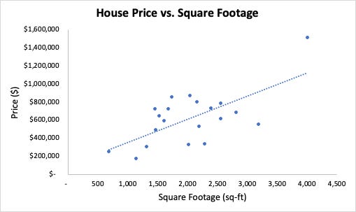
The fact that the correlation is positive tells us that one quantity tends to increase as the other does. This is what we expect: bigger houses are more expensive. As for the magnitude, correlation is always between 0 and 1 in absolute value. Most would consider 0.67 fairly high, which suggests that square footage is an important predictor of price. The “R-squared” value—literally, correlation squared—is interpreted as the percentage of variation in price that can be explained by square footage. In this case, that percentage is .67*.67 = 44%.
I mentioned earlier that correlation measures the linear relationship between two variables. If you perform a simple linear regression between X and Y, the resulting best-fit line has a slope b that depends on the correlation:
Moreover, correlation = 1 (or -1) if and only if the relationship between X and Y is exactly linear, meaning that all of the points (X_i, Y_i) fall on the same line. While this is helpful for interpreting correlation, it does lead to some limitations of Pearson as a metric. For example, the following variables X and Y have a correlation of 0, which you can tell from the trend line being horizontal (i.e., slope 0).

Clearly, X and Y move together, and it’s easy to see the pattern. Nonetheless, the Pearson correlation says that they have no discernible relationship. The explanation is that they have no discernible linear relationship. In this case, it is purely quadratic. Here is a famous picture—called “Anscombe’s quartet”—to show how ugly this can get. Each of the 4 pictures below displays the same correlation (.816).

Spearman correlation
In the previous section, we saw that capturing only linear relationships is a drawback of Pearson correlation. Now I want to see if we can get rid of that feature. Let’s start with one interpretation for positive correlation: as X increases, Y tends to increase as well. Notice that there’s no notion of linearity in there. For example, Y = 2^X has this property: as X increases, so does Y. But this function is exponential, which is very much not linear. To turn this idea into a metric, one thing you can do is rank each of the points in the X and Y vectors. For example, consider the following pairs of points: (-2, 1), (2, 7), (4, 3), and (5, 8). In ascending order, the ranking of the X values are 1, 2, 3, and 4. The Y values are 1, 3, 2, 4. This gives us corresponding “ranking pairs” of (1, 1), (2, 3), (3, 2) and (4, 4). Spearman correlation is defined as the (Pearson) correlation of the ranking pairs. If we apply this procedure to the Seattle housing data from above, the resulting correlation is .495.

Pearson correlation is equal to +/-1 if and only if each pair of points in the dataset lies on the same line. Spearman correlation is equal to +/-1 if and only if the rankings of the x’s and y’s are exactly the same (+1) or exactly opposite (-1). (In math speak, the Spearman correlation is +/-1 if the data is monotonic.) Why? In the positive case, if the rankings of the x’s and y’s match, then the ranking pairs will be (1, 1), (2, 2), … (n, n). All of these points lie on the line y = x, which we know means the data has Pearson correlation of +1. In the negative case, the rankings (1, n), (2, n - 1), …, (n, 1) all fall on the line y = -x + (n - 1). The slope of this line is negative, meaning the correlation is -1. Here’s an example of Pearson and Spearman correlation computed on the same data.

We see in the left picture that y tends to decrease as x increases. However, the relationship is clearly not linear. For this reason, Spearman correlation should be higher (in absolute value) than Pearson. Both should be negative because x and y move in opposite directions. Using the Excel function CORREL on each of the underlying data and the rankings yields a Pearson correlation of -.77 and Spearman correlation of -.98 (nearly perfect). While this is expected result, it’s interesting how high the Pearson correlation is. Despite the relationship being nonlinear to the eye, the underlying linear relationship is still pretty strong. Nonetheless, we would probably be in trouble if we tried to extrapolate—meaning, use the trend line to predict y for values of x outside of what is shown.
Lest you think that Spearman correlation can always pull Pearson out of trouble, remember that not all relationships are monotonic. For example, the quadratic data I showed above also has a Spearman correlation of 0 (or approximately 0, depending on how you handle ties in rankings). To handle non-monotone relationships, you typically have to rely on other tests (e.g., something called the Hoeffing D statistic). Alternatively, you can transform your data before computing the correlation. (For example, take the square root of the y’s if you think there is a quadratic relationship between x and y.) The quadratic example teaches us the following general fact:
If X and Y are independent, they are also uncorrelated (i.e., Pearson or Spearman correlation is near 0.) The converse is not true; two variables can have correlation 0 and be dependent.
So which one should you use?
I’ll close by giving some guidance on which correlation is more useful for your situation. Frankly, you might as well compute both of them. If our computers can train 50-gazillion-parameter LLMs, they can probably handle one extra correlation calculation. But which one should you feature in your report at work? Here are some guidelines. Use Pearson correlation if:
You have a reason to believe that there is a linear relationship between two variables.
The regression coefficients are important to you. For example, the slope of the trend line in the housing data is price per square foot, which is a useful metric. Pearson correlation is a natural measure of how accurate this slope is.
You don’t want to explain to someone what Spearman correlation is.
On the other hand, consider Spearman correlation if:
Your data is monotonic, but not linear
Your data has some severe outliers (translating to rankings will get rid of huge numbers)
Your data is ordinal, but there is no meaning in the difference between your categories
Let me elaborate on the last point. You’ve probably taken surveys with Likert scale questions: strongly disagree, disagree, neither agree nor disagree, etc. It’s common to analyze these by translating the responses to integers: 1, 2, 3, … There are some diehards who say that you should never use Pearson correlation to analyze the relationship between different Likert scale questions. The rationale is that Pearson views the distances 1→2, 2→3, 3→4, … as all the same. (That part is true.) On the other hand, there’s no way to make sense of the “distance” between “strongly disagree” and “disagree.” And if you did, you certainly couldn’t compare it to the distance between “disagree” and “neither agree nor disagree.” Therefore, it makes more sense to use Spearman, which doesn’t care about the distances between those responses. I can’t argue against that point of view, although I have to say that I’ve been guilty of using Pearson in that context. I do so because it’s much easier: you can knock out the pairwise correlations for all survey questions with one click in Excel (the correlation tool in the Data Analysis add-on). Conversely, Excel has no native function for Spearman correlation. You have to manually make the rankings (RANK.EQ) and then apply CORREL. In my experience, the difference is usually small, and the conclusion doesn’t change.
Thank you for reading. Please subscribe and refer your friends for rewards.
You’ll also see ρ (rho) used to denote the correlation coefficient. Usually, ρ is used for a population, and r for a sample, keeping the tradition of using Greek letters for populations and Roman letters for samples.